PayPal web redesign
Role: visual Design Lead | UX Design Lead for Summary
Led the UI design for the major redesign of PayPal's consumer website, which launched globally to 24 countries and 154 million customers in May 2014.
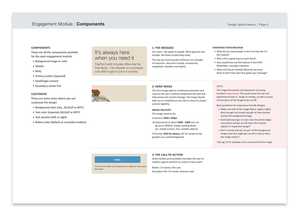
The original website had 194 words, 54 links and buttons, 14 distinct components, and was not optimized for mobile. This redesign focused on simplifying the customer interface, responsive web design, and incorporating mobile first methodology.
“PayPal.com just got an app-inspired face-lift designed to make it easier for you to check your balance, transfer money, and — most importantly for PayPal — do business with its merchant partners.”
Redesigning PayPal.com
summary
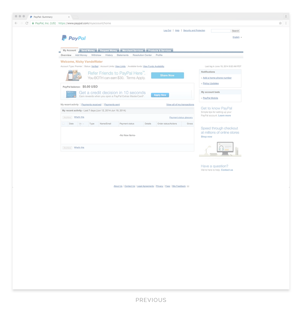
The original PayPal.com home landing page was cluttered with links, marketing ads, and other UI elements that competed for the customer’s attention.
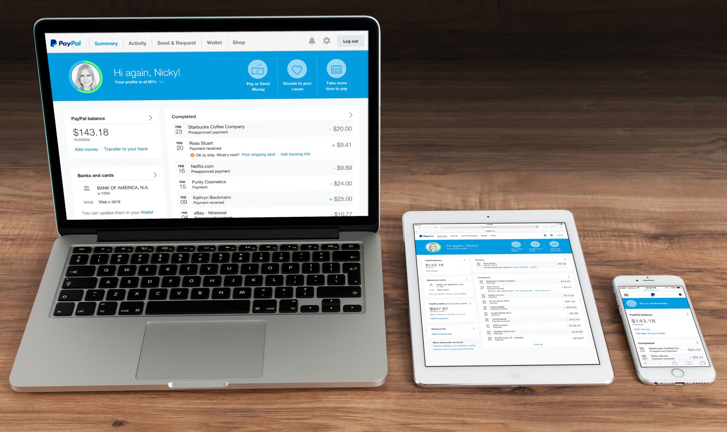
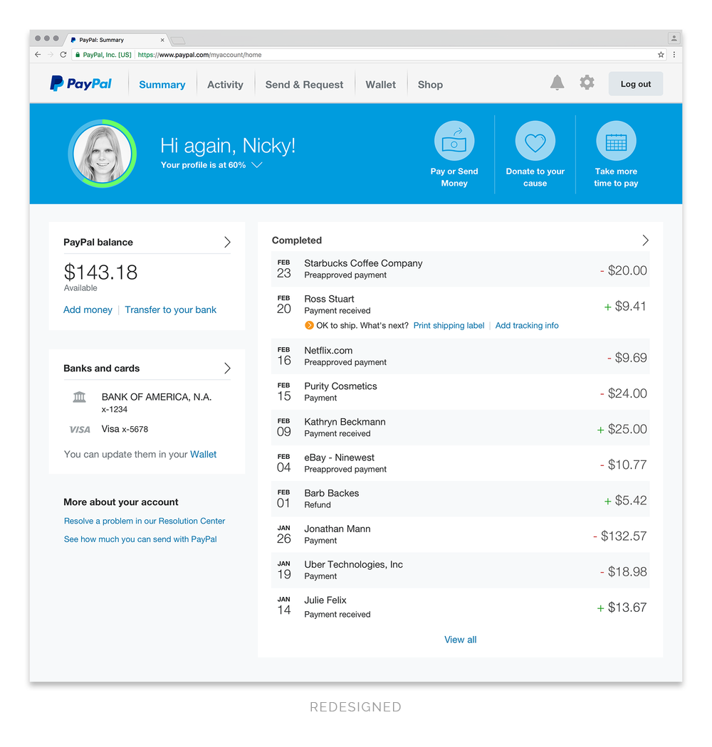
The redesigned Summary page provides customers with a snapshot of the information most relevant to them (i.e. their PayPal balance, wallet, and activity). It also features a bold banner dedicated to increasing customer engagement including account completion and marketing of features.
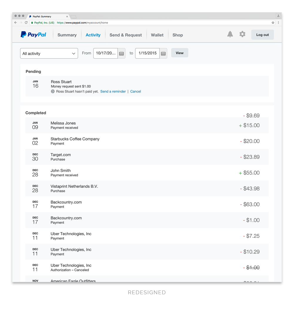
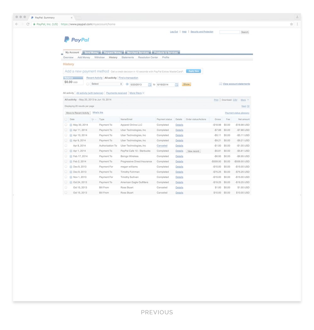
activity
The old Activity page had unnecessary redundant info and lacked visual hierarchy. The redesigned Activity page groups transactions within pending or completed sections for easier scannability and to eliminate redundancy.
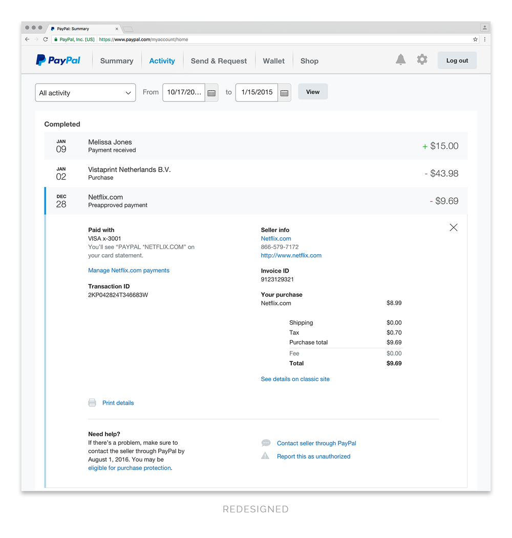
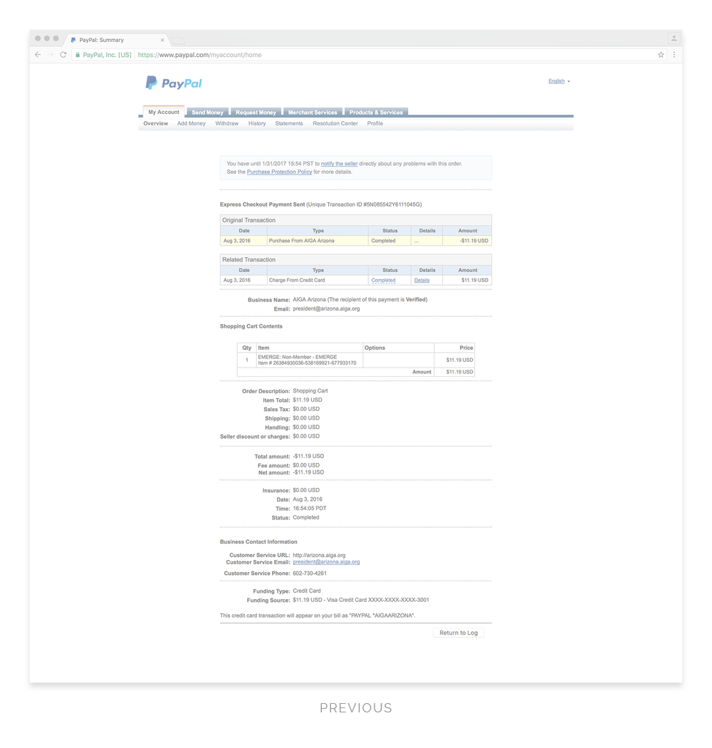
TRANSACTION DETAILS
The old transaction details was full of unnecessary information and difficult to scan through and comprehend. The redesigned transaction details groups the information in logical sections, uses friendlier language and has a simplified layout.
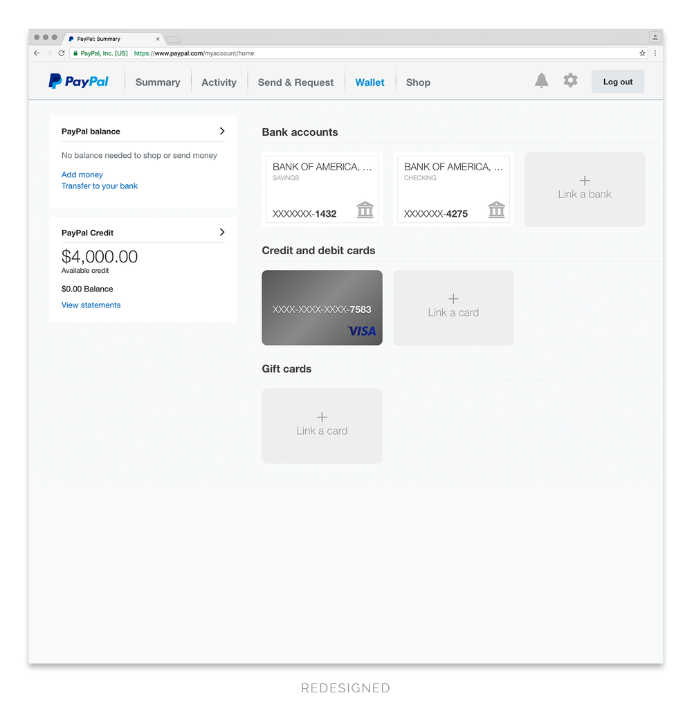
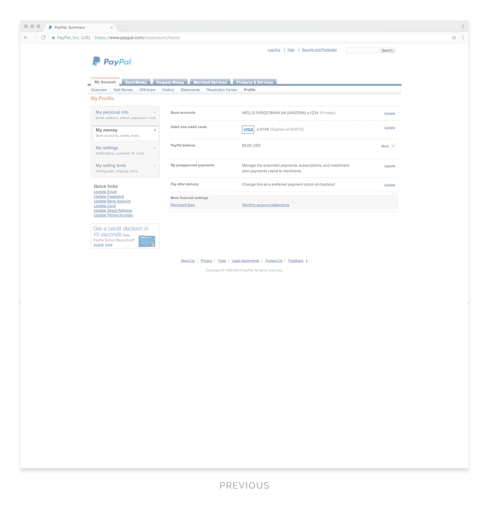
Wallet
The old wallet page was tucked within the user's profile and hard to locate. The redesigned wallet page provides a dedicated space where a customer can get a quick snapshot of their PayPal balance and linked accounts.
“Nicky’s most significant contribution? Hmmm...let me think. Well, she single-handedly designed the look and feel for the new logged-in PayPal experience to be rolled out globally in 2014 (and did so in about 2 weeks time)...so there’s that!”
Responsive web
Placeholder content.


“I have not seen a visual designer or many designers in general take the lead like you do when provided little to no direction on frequent occasions. Your wonderful attitude, persistence, and passion are key to this team’s success and the project’s success.”